Páginas

Sunday, October 31, 2010

Visits to my blog.

After receiving some emails about this, I noticed that most of the visitors coming to my blog come from od[force] community. od[force] is a great place to hang out if your interested in real high end VFX, as a lot of people there are active in the industry and working in places like Dream Works, Sony Imageworks, Disney, SideFX and others.

Although I've been mentioning Blender a lot on my post I still use (and love) Houdini when ever I can, and have the free time of course :-)  

I used to have a personal web page where I would post a lot of my tests done in Houdini, so I should start to post them here as well.

Below is a quick reel I was asked to come up with, related to TD :-|  I make that "weird" face there because there is a relatively small amount of pretty images you actually produce when you're spending long hours trying to  figure out how to optimize/create workflow than actually pressing the "render" button :-) And if you have the chance to press it, it usually is only a proof of concept without any decent texture or lighting.

Here it is anyways, the year was 2006 and the shots description follows below the video. 


Scene 1 – Procedural City: 
Procedural  city  builder  done  using  basic  stamp functions on Copy SOP.  I kept the scene small (only 42 nodes). 

Scene 2 – Particles: 
Subdivided in two shots, the first was just a test with  POPs  but  it  still  came  out  with  a  beautiful flow  and  structure  besides  its  simplicity.    The second  scene  is  a  small  portion  of  a  larger animation showing the flow of material inside an cement  grinding  mill.  The  final  output  was  an interactive presentation for e-learning. 

Scene 3 – Non Photorealistic Rendering Shader : 
NPR  has  been  one  of  my  interests  for  ages because of my background in Painting. This was one  of  the  tests  to  mimic  comic  book  style rendering. Animations were all simple moves, but the  intention  was  seeing  its  behavior  to  moving light and camera. 

Scene 4 – Day to Night and 2D to 3D: 
Two different projects with the same theme. The first challenge was to convert a simple day picture found on the net to a night shot. Later I decided to push this challenge a bit further by modeling the entire scene in 3D to make a camera movement. 

Scene 5 – Unigraphics NX custom tool: 
For the last few years I’ve been working with High End CAD systems for the industry as an instructor and solution provider. This is one example of a customization done for a client using GRIP, a macro language for NX.

Software used:
Houdini, UG-NX, Photoshop and Notepad.

Saturday, October 30, 2010

Blender house revision.

Here is a new try at rendering the house I made as a test drive for Blender's rendering engine.


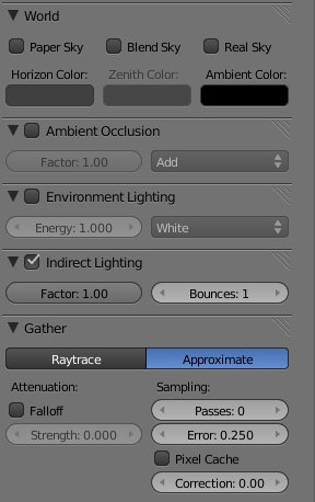
I had to render it in separate passes to composite it out in Photoshop. Also, the ambient occlusion pass was a complete re-render, because if I understood right, to be able to use the indirect illumination inside Blender, I was only allowed to use approximation gatherer. 


 And with that I wasn't satisfied with the ambient occlusion pass, as it was to blurry in my oppinion. So for the ambient occlusion pass I used the raytrace gatherer. It's crispiness was crucial for me to achieve the fine details in the corners of the mesh.


Things I would like to have in the renderer:
  • Separate controls for ambient occlusion, environment lighting and indirect illumination.
  • Pixel displacement. The rock wall around the garden still looks flat only relying on bump map and diffuse texture map. The ambient occlusion is not calculated considering the bump map.


If I continue refining this scene, i should:
  • Work on some textures like the asphalt, it has a bad tiling. 
  • Try a new approach to the grass, maybe give a try at fur.
  • Add more mesh details, maybe on the rock wall and try vertex displacement.
I'd love to hear some comments on how can I improve this scene in Blender.

Cheers,
Andz


Wednesday, October 27, 2010

First two Blender renderings.

These are the first two renderings of my tests in Blender.

First one is Tea Box, I was still learning the modeling and UV mapping tools. I was still having a hard time understanding the materials and textures at this time. There are some color bending on the background that I think is caused by a bad smoothing on the infinite plane.  If I spend time again on this file, I would redo the two tea bags on the right.


The second image is more recent, I just finished the rendering last night, but I'm still not 100% happy with the illumination and colors. Right now it has to much contrast, maybe because of the lack of indirect illumination. I also think that the colors don't look right, it looks almost like a painting.


  I'll be definitely trying a new rendering on this one.

So, things that I'm still trying to adjust my self in Blender:
  • Complex scenes organization;
  • Materials;
  • Lighting;
  • Rendering parameters.

Friday, October 8, 2010

Kitchen visualization.

I haven't been doing architecture visualization in a long time, so I started this kitchen as a personal project. It was done in 3DS MAX and Mental Ray.

I have been trying it with 3 different lighting setups.

Overcast
Night
 Morning

New images in 3D gallery.

I uploaded two character images to the 3D gallery.

Tuesday, October 5, 2010

New images at the 2D gallery

I have uploaded some images to my 2D gallery.

These are all personal projects, I still need a permission to post some of my recent works.

Minimalist sale.

I have been reading a lot a about minimalism in life in general. It may be applied to everyday living, working, etc.

Yesterday I bought a pack of 17 e-books on the subject, which some of them you can read a few pages and see what it is all about. I should post my reviews on them.

Click here to view more details on the pack