To finalize the production of the Turma Cósmica series, I'd like to present some details on the latest games that we produced.
Although they are only mini-games, they can be considered as the latest technology for us at the time. Instead of a physical media these are all played online on a web browser using Unity 3D engine and are multiplayer. For modeling and animation we used
Blender, a free opensource graphics software. Many of the textures were painted in Blender as well and finalized in Photoshop.
Next, are some concepts I made before the actual production.
First, I was just exploring the concept of a 3D board game, how it would look like in perspective, trying to find out problems that I could face later on like confused path, or things hidden form the viewer. I had to always keep in mind that these were for young children.
Next I was looking for how much I could push complexity on the path and amount of "houses" (landing places) for the board. My intention was to also use dices, because that is also part of the math subject that the student would be learning in class at this period. At this stage you can also see that I started to use some type of color identification on each house. These would represent the type of question the student would be asked.
So here is how the challenge would be presented. Instead of just adding up (math) the amount acquired of the 3 dices, the student would chose the sequence he would use the 3 dices. For example, the student threw the dices and got 3,2 and 2. If he has more ability in sciences, the could chose to use first one of the dices that had the value of 2 if that will help him to land on a house that is represented by the color of sciences. Later he can chose if it will use the dice of 2 again or the 3 and so on. So there is also strategy that will be used during the game play. On the final version of the game, there were also black colored houses that would be a surprise subject.
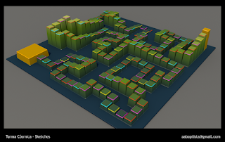
On the following image I represented the final look and feel of the game. You can see I chose the theme and the color pallet. Sketches like these were not supposed to look exactly like the final game just a general idea. Since I did at least 10 different variations of these in one day, not much care was used in the perspective or texture details, they should be done really fast. The first two images above were done in Blender, although it is a 3D software, it is amazingly fast to model, so for just basic layout, trying out different points of view it is a indispensable tool.
These sketches now are for the sand tracks race. Since these were all 3d games, I used Blender again to try out how the track would look in a perspective, its width, how the user would perceive it all.
This sketch I called something like high tech track, who knows, maybe this classic game here in Brazil should look more futuristic... how would kids from the future play this on a Space Station ? Maybe they could even have Storm Troopers uniforms for school? :-)
Actually the test was for trying out if I could just model some basic building blocks and make many different tracks from these. Who knows? Maybe even a procedural build track, that a new one could be generated on every game play?
Then I got melodramatic and decided to go back to the old sand box style track. Remember, the time to get crazy idea is now, when you're just doing concepts. It is better to try something silly and then give up on it now than later on the production process when there is not a whole team working in it. Specially if there are programmers involved, they hate changes :-).
Now I went to sketches in Photoshop where I'm starting to define color pallets and some basic GUI (graphical user interface ) layout.
The more refined and revised GUI layout. You can see on this one that I had also checked to see how the GUI would adjust to different screen aspect ratios, that is what the subtle darker bands are for on each side of the image. The smaller area is a 4:3 (letter box) aspect ratio found on older TVs and computer monitors and the wider one is 16:9 (HD video standard) found on more modern LCD monitors or some smart phones and tablets.


